

If you’re new to design, knowing your way around Understanding UI Design Elements and Components is like learning the ABCs of creating amazing apps and websites. These elements and components are the essential tools that designers use to craft smooth, user-friendly digital experiences. Let’s walk through them together in a way that’s simple, visual, and fun!
What Are UI Design Elements?
To begin with, Understanding UI Design Elements and Components starts with the basics—UI elements. These are the individual parts of a user interface that users interact with. Think of buttons, text fields, icons, or even navigation bars. They make up the surface of your digital design and help users do things quickly and easily.
Why are they important?
- They guide users by showing what to click, where to type, or how to navigate.
- They improve usability by making the interface feel familiar and easy.
- They support accessibility so everyone can interact with the interface.
- They enhance aesthetics, giving users a pleasant visual experience.
For example, a well-placed search bar can help users find what they need instantly, while a clear error message tells them what went wrong and how to fix it.
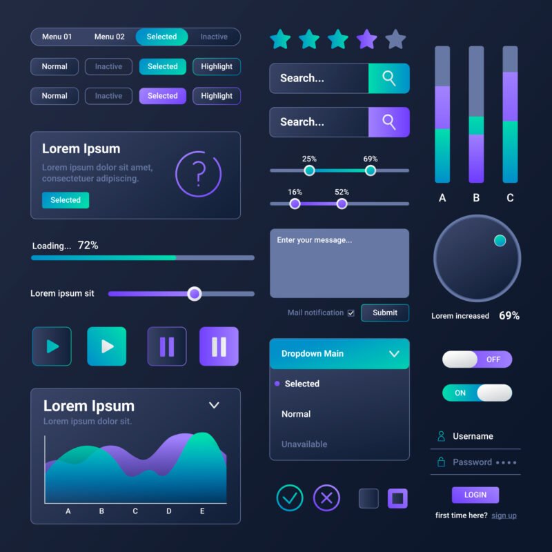
Types of UI Design Elements
There are different types of UI elements. Here’s a breakdown:
1. Input Elements
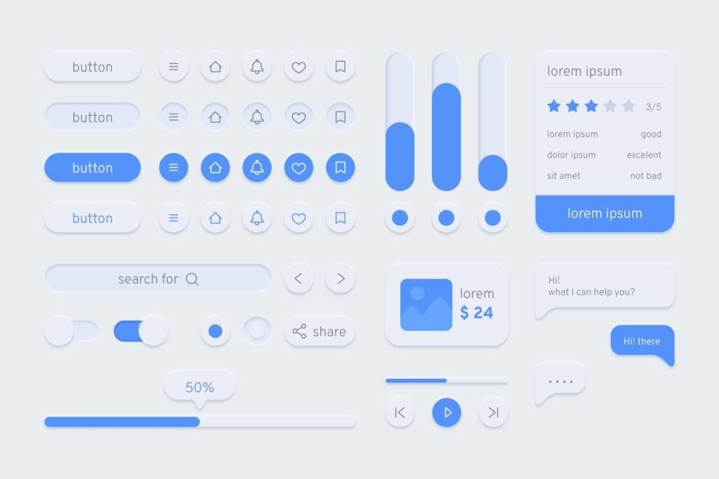
- Buttons: Let users take action (e.g., “Sign Up” or “Submit”).
- Icons: Represent actions or content visually (like a trash bin for delete).
- Text fields & Forms: For entering information.
- Dropdowns, Modals & Cards: Display choices or additional info.
📌 Example: Filling out a form to register for an account involves typing into text fields, selecting a country from a dropdown, and hitting a submit button.
2. Output Elements
- Success or Error Messages: Let users know if their action worked.
- Alerts: Warn users or give feedback.
📌 Example: If you enter a wrong password, the system shows an error message.
3. Helper Elements
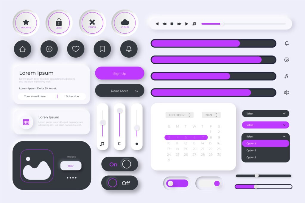
- Breadcrumbs: Show where you are on a site.
- Progress Bars & Tooltips: Help guide users through steps or explain options.
📌 Example: A progress bar during sign-up shows how close you are to finishing.
From Elements to Components
Now that we understand the parts, let’s see how they come together in UI Elements: Understanding UI Design Elements & Components.
Think of UI components as pre-made building blocks that combine multiple UI elements. It’s like snapping Legos together—you use small pieces (UI elements) to build a bigger object (a component).
Common UI Components (With Examples)
Navigation Bar
A menu bar with icons or links like Home, Search, and Profile.
- Includes buttons, icons, and sometimes text labels.
Search Box
A text field combined with a search button and an icon.
- Includes: text field (input), magnifying glass icon, search button.
Pop-Up Message
Appears when a task is complete or when action is needed.
- Includes: message text, a close button, and maybe an icon.
📌 Example: Netflix asking, “Are you still watching?” is a UI component made up of several elements.
UI Elements vs. UI Components
Let’s break it down:
- UI Elements = Small ingredients (buttons, icons, fields).
- UI Components = Full combo meals made from elements (nav bar, search box, forms).
📌 Imagine building a burger: UI elements are the buns and patty; UI components are the whole burger.
Why UI Components Matter in Design
In the bigger picture of UI Elements: Understanding UI Design Elements & Components, components:
- Speed up development by reusing parts.
- Keep things consistent so users don’t get confused.
- Make the design scalable, meaning you can grow and update easily.
- Improve user experience by making everything predictable and reliable.
Final Thought: Understanding UI Design Elements and Components
Mastering UI: Understanding UI Design Elements & Components helps you build digital products that are both beautiful and functional. By learning the difference between elements and components—and how to use them—you’ll design apps and websites that users love to explore.
So the next time you open an app, take a look at the buttons, forms, and nav bars. You’ll see that every detail was designed with intention, and now, you’ll understand exactly how it all works!
